Pearls for Thine
Alright, the FTP let me in. Still slow, but all the pictures are here. 'Enjoy!'
Last night, I put together the 'final' KPMG comic. Here's the illustration:
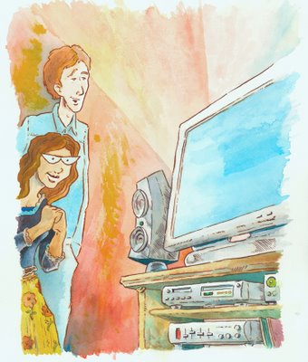
First, before going to the wake on Monday, Yesenia & I went down to Pearl Paint to pick up some paper and other supplies. Since I was doing this one in watercolor, I wanted to find a paper that matched the stuff that I did some of my better watercolor illustrations in college (I'll get together a few of those for post later this week). Turned out to be 300lbs Hot Press Arches Watercolor paper - really, really nice stuff. I hadn't bought this stuff in almost twenty years, and it felt oddly good.
I also picked up some frisket film, if I needed.
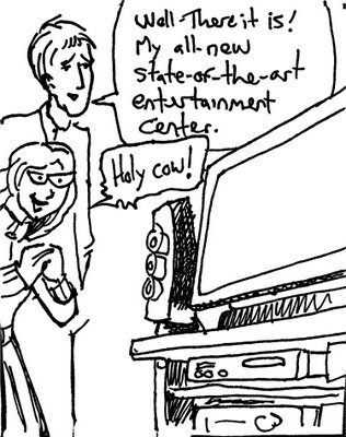
Anyway, later that night, I came back and did the illustration. The method: blew up the previous version of the first panel to about 8" x 10", taped that to the back of the Arches, and laid it on my lightbox. The previous version was don this way as well, directly from the sketch. Each new version gets some refining, but not always an improvement. For example, here's the sketch version, which took about two minutes to draw:
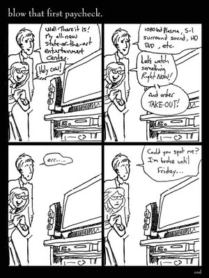
That was then cloned, the original hand lettering scanned in and placed, and with only the different facial expressions, putting it together in Photoshop went pretty quickly:
When that comp was approved, I blew up the first panel, taped it to the back of some bristol, threw it on the lightbox, did some pencil lines to get the characters 'on model,' but you can see that the 2nd draft still kept a lot of the looseness of the first. I decided to ink it all in brush, because I can work looser and more dynamically (and faster), but also because I've really made it a goal to master dry brush, so you can see I trotted it out here in a few places:
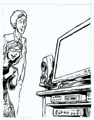
Then I redid the lettering and the facial expressions, all on the same piece of bristol (which looks rather abstract:
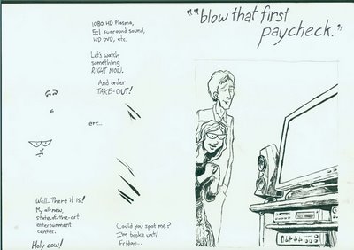
Then I comped that one together, only swapping out the facial expressions and dialogue. Then I colored the whole thing:
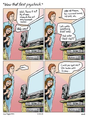
They asked that the characters look younger, and for a couple small word changes, so I softened his features with the clone tool and copied and pasted to change text:
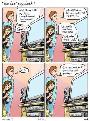
And I was a smart guy: I left the whole thing in layers, particularly the word balloons and dialogue. So, when the approval came in, it was just a matter of doing the illustration over, and changing the panel borders and dialogue to a brown to match the brown ink in the new watercolor version. Karl gave me some good advice on what real state-of-the-art home theater standards are, so I made one more text change. You'll note that in the illustration, I softened the guy's features even further.
A little more cloning and moving, and the thing was done:
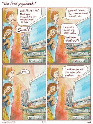
So, we'll see.
I have to say that as a student, I loathed process. Hell, as a student, I loathed college, but I must confess that practically every technique I employed here was something I picked up at RISD. Even the aesthetic choice of the brown ink instead of black for the watercolor was based on a senior illustration show I saw at the school when I visited in my senior year of High School. The tracing paper route came courtesy of the then unfollowed advice of Mahler Ryder. I know my time with Russell Jones also influenced my watercolor technique. So, what do you know? Maybe my RISD education is finally starting to pay off - at 500 bucks a pop.
D.
Last night, I put together the 'final' KPMG comic. Here's the illustration:

First, before going to the wake on Monday, Yesenia & I went down to Pearl Paint to pick up some paper and other supplies. Since I was doing this one in watercolor, I wanted to find a paper that matched the stuff that I did some of my better watercolor illustrations in college (I'll get together a few of those for post later this week). Turned out to be 300lbs Hot Press Arches Watercolor paper - really, really nice stuff. I hadn't bought this stuff in almost twenty years, and it felt oddly good.
I also picked up some frisket film, if I needed.
Anyway, later that night, I came back and did the illustration. The method: blew up the previous version of the first panel to about 8" x 10", taped that to the back of the Arches, and laid it on my lightbox. The previous version was don this way as well, directly from the sketch. Each new version gets some refining, but not always an improvement. For example, here's the sketch version, which took about two minutes to draw:

That was then cloned, the original hand lettering scanned in and placed, and with only the different facial expressions, putting it together in Photoshop went pretty quickly:

When that comp was approved, I blew up the first panel, taped it to the back of some bristol, threw it on the lightbox, did some pencil lines to get the characters 'on model,' but you can see that the 2nd draft still kept a lot of the looseness of the first. I decided to ink it all in brush, because I can work looser and more dynamically (and faster), but also because I've really made it a goal to master dry brush, so you can see I trotted it out here in a few places:

Then I redid the lettering and the facial expressions, all on the same piece of bristol (which looks rather abstract:

Then I comped that one together, only swapping out the facial expressions and dialogue. Then I colored the whole thing:

They asked that the characters look younger, and for a couple small word changes, so I softened his features with the clone tool and copied and pasted to change text:

And I was a smart guy: I left the whole thing in layers, particularly the word balloons and dialogue. So, when the approval came in, it was just a matter of doing the illustration over, and changing the panel borders and dialogue to a brown to match the brown ink in the new watercolor version. Karl gave me some good advice on what real state-of-the-art home theater standards are, so I made one more text change. You'll note that in the illustration, I softened the guy's features even further.
A little more cloning and moving, and the thing was done:

So, we'll see.
I have to say that as a student, I loathed process. Hell, as a student, I loathed college, but I must confess that practically every technique I employed here was something I picked up at RISD. Even the aesthetic choice of the brown ink instead of black for the watercolor was based on a senior illustration show I saw at the school when I visited in my senior year of High School. The tracing paper route came courtesy of the then unfollowed advice of Mahler Ryder. I know my time with Russell Jones also influenced my watercolor technique. So, what do you know? Maybe my RISD education is finally starting to pay off - at 500 bucks a pop.
D.

2 Comments:
The watercolor is nicely done, but I prefer the previous version with the computer coloring and black inking. But I guess the client wanted the watercolor, and you delivered the goods.
P.S. Watch out, I'm actually starting to draw again... I 'm gonna do the Scaredy Cat cover...
Yah. I think the watercolor as a stand-alone illustration is nice, but in the comic, it has less impact than the black & computer color.
I'm definitely looking forward to that cover. And now that my schedule is open, I want to make some time to scan the whole book with you some weekend. Let me know.
D.
Post a Comment
<< Home