Process
So, KPMG asked if I could add color to the comic - I have a little more time, since it's due at the print house on Monday morning. Adding color to a page like this is a little bit of a technical challenge, since I inked the page to be reproduced in black and white.
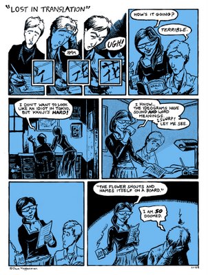
Still, the first rule of color is to start with a ground - that is, a base color that you then build all the other hues out of. In this case (and, indeed, in many cases), I chose a cool blue as the unifying color scheme:

And that's where I stopped when it was time to leave for the P.C.M.A. recording session today. Close observers may note that I took advantage of the extra time to do a little patchwork on the bottom left panel, which was bugging me a lot. Really, it's the kind of thing that should have been fixed at the layout and pencil phase, but I had to rush through every step and kept thinking I'd fix it when it came to the next step. No - if something looks bad in graphite, it looks double-bad in ink.
Anyway, I didn't do any redrawing, I just realized that the next best thing to erasing and redoing the female figure in that panel was to improve the composition and spatial relationships, so I blew her up about fifteen percent and shifted her right to just behind the chair. At least the design is more interesting - and I'll live with it. If I have a little time after the coloring, I'll see if I can doctor her features somewhat, to tease out a subtler expression and to bring her back 'on model.'
I had hoped to get the complete original version on the page, but in the day and age of Photoshop, the original drawing is just the beginning.
D.
Still, the first rule of color is to start with a ground - that is, a base color that you then build all the other hues out of. In this case (and, indeed, in many cases), I chose a cool blue as the unifying color scheme:

And that's where I stopped when it was time to leave for the P.C.M.A. recording session today. Close observers may note that I took advantage of the extra time to do a little patchwork on the bottom left panel, which was bugging me a lot. Really, it's the kind of thing that should have been fixed at the layout and pencil phase, but I had to rush through every step and kept thinking I'd fix it when it came to the next step. No - if something looks bad in graphite, it looks double-bad in ink.
Anyway, I didn't do any redrawing, I just realized that the next best thing to erasing and redoing the female figure in that panel was to improve the composition and spatial relationships, so I blew her up about fifteen percent and shifted her right to just behind the chair. At least the design is more interesting - and I'll live with it. If I have a little time after the coloring, I'll see if I can doctor her features somewhat, to tease out a subtler expression and to bring her back 'on model.'
I had hoped to get the complete original version on the page, but in the day and age of Photoshop, the original drawing is just the beginning.
D.


0 Comments:
Post a Comment
<< Home