Behind the Panels
One thing is for sure: at some point in the hopefully not-too-distant future, I'm going to look back at the winter and spring of 2009 and let go one huge mother sigh of relief. Really, I feel like I've been holding my breath one way or another for most of the past decade, and the last few months have had me hitching it tighter and tighter. The expanding oxygen-poor dead zones in the Pacific off the Oregon coast aren't due to any kind of global warming phenomena - it's because I've been holding all the extra air in that the fish need. Sorry, fish.
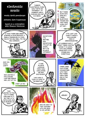
Bits of business: I did promise that I would fill in the story behind that comic from Friday, didn't I? Not so much to tell: the editor of "Signal to Noise" (the music magazine that I did the Street Fair comic for a few months back) contacted me back in January and proceeded to give my ego one of the better strokes it's had in many a year - namely, that David Greenberger was going to be writing a comic for the magazine, and out of all the samples that the editor (hereafter known as 'Peter') had shown him, he decided that he wanted to work with me. Which was (is) very cool, considering the place in alternative culture that Greenberger holds and the artists that he's had illustrate his stories in the past. I'll really have to track down a copy of 'Duplex Planet Illustrated' to find the full list, but Dan Clowes and Jason Lutes were definitely in there, and that's company I'm pretty pleased to be in with.
But the main thing that made it cool was that when I first responded to the editor's ad for submissions last summer, it was with the hope that I'd get a chance to collaborate - something I've always enjoyed but had little chance to do. I was sort of surprised that no-one on his staff had any script or anecdote they wanted to see as a one-page comic, so I semi-reluctantly wrote one myself and they happily ran that. From my perspective, the first comic was a mixed bag - decent drawing and nice concept, but dry and kind of pointless.
So when Peter asked me if I wanted to draw a comic written by David Greenberger for the follow-up, it was a bit like playing bass in an anonymous amateur bar band for a first gig, and then getting asked to produce a Hüsker Dü record. I'd wanted to draw a comic from someone else's script. I was thrilled to have that someone be a writer whose work I've admired for some 20 years.
The actual process was quick and straightforward enough. The script itself was essentially just the monologue, accompanied by Mr. Greenberger's suggestion that it should be illustrated with the speaker in the center, surrounded by unspecified images of recording and music technology, past and present. I thought about it for a little bit, and offered the concept of the panel transitions instead, with a marked difference in illustration style between the speaking panels and the spot illustrations - playing off of a documentary idea, with black & white interview footage and color flashbacks. He liked it, and I did the comp, below:

You'll note that the final parallels it almost identically - the simplicity of the approach let me off the hook when it came to laboring over extensive drawing. I have to give credit to Marina, here, for offering the suggestion of the iPod image, when I couldn't think of what would represent modern electronic music. Without a doubt, the sharpest idea on the page. The only change that Greenberger had was asking me to make her hair a little more feminine, which is a spot-on criticism, in retrospect. I'd been making the mistake of thinking of her as a wiry old broad, but it's sometimes easy to get too caught up in little ideas like that and forget to convey the basic information visually as fast as possible. If there were any confusion about the gender of the speaker (she does look pretty mannish in the original sketches), it would bog the reader down.
The final color illustrations were done very, very quickly, with lightbox, watercolor, sepia ink and colored pencils. I quickly abandoned the idea that I was going to try to get all of the black and white and color images produced on the same page of original art - the logistics of that were daunting and would have added hours of work time. Doing each color illustration separately and then placing them in the layout digitally let me do the entire final page - pencils, inks, letters, color, and assembly - in record time. And I have to say I'm much happier doing real world color than computer color, which can be tedious to produce and overdone.
At any rate, both Peter and David Greenberger were happy with the results, and hopefully we'll be doing another of these sometime closer to the summer.
I'm hoping to put all of these little experiments with form and media together into something a little longer - the 'Renunciation' 10-page story that I mentioned here back in Spring of '07 would be a perfect candidate for the watercolor, prismacolor and sepia ink method.
D.
Bits of business: I did promise that I would fill in the story behind that comic from Friday, didn't I? Not so much to tell: the editor of "Signal to Noise" (the music magazine that I did the Street Fair comic for a few months back) contacted me back in January and proceeded to give my ego one of the better strokes it's had in many a year - namely, that David Greenberger was going to be writing a comic for the magazine, and out of all the samples that the editor (hereafter known as 'Peter') had shown him, he decided that he wanted to work with me. Which was (is) very cool, considering the place in alternative culture that Greenberger holds and the artists that he's had illustrate his stories in the past. I'll really have to track down a copy of 'Duplex Planet Illustrated' to find the full list, but Dan Clowes and Jason Lutes were definitely in there, and that's company I'm pretty pleased to be in with.
But the main thing that made it cool was that when I first responded to the editor's ad for submissions last summer, it was with the hope that I'd get a chance to collaborate - something I've always enjoyed but had little chance to do. I was sort of surprised that no-one on his staff had any script or anecdote they wanted to see as a one-page comic, so I semi-reluctantly wrote one myself and they happily ran that. From my perspective, the first comic was a mixed bag - decent drawing and nice concept, but dry and kind of pointless.
So when Peter asked me if I wanted to draw a comic written by David Greenberger for the follow-up, it was a bit like playing bass in an anonymous amateur bar band for a first gig, and then getting asked to produce a Hüsker Dü record. I'd wanted to draw a comic from someone else's script. I was thrilled to have that someone be a writer whose work I've admired for some 20 years.
The actual process was quick and straightforward enough. The script itself was essentially just the monologue, accompanied by Mr. Greenberger's suggestion that it should be illustrated with the speaker in the center, surrounded by unspecified images of recording and music technology, past and present. I thought about it for a little bit, and offered the concept of the panel transitions instead, with a marked difference in illustration style between the speaking panels and the spot illustrations - playing off of a documentary idea, with black & white interview footage and color flashbacks. He liked it, and I did the comp, below:

You'll note that the final parallels it almost identically - the simplicity of the approach let me off the hook when it came to laboring over extensive drawing. I have to give credit to Marina, here, for offering the suggestion of the iPod image, when I couldn't think of what would represent modern electronic music. Without a doubt, the sharpest idea on the page. The only change that Greenberger had was asking me to make her hair a little more feminine, which is a spot-on criticism, in retrospect. I'd been making the mistake of thinking of her as a wiry old broad, but it's sometimes easy to get too caught up in little ideas like that and forget to convey the basic information visually as fast as possible. If there were any confusion about the gender of the speaker (she does look pretty mannish in the original sketches), it would bog the reader down.
The final color illustrations were done very, very quickly, with lightbox, watercolor, sepia ink and colored pencils. I quickly abandoned the idea that I was going to try to get all of the black and white and color images produced on the same page of original art - the logistics of that were daunting and would have added hours of work time. Doing each color illustration separately and then placing them in the layout digitally let me do the entire final page - pencils, inks, letters, color, and assembly - in record time. And I have to say I'm much happier doing real world color than computer color, which can be tedious to produce and overdone.
At any rate, both Peter and David Greenberger were happy with the results, and hopefully we'll be doing another of these sometime closer to the summer.
I'm hoping to put all of these little experiments with form and media together into something a little longer - the 'Renunciation' 10-page story that I mentioned here back in Spring of '07 would be a perfect candidate for the watercolor, prismacolor and sepia ink method.
D.


0 Comments:
Post a Comment
<< Home